

Objective
Quora has built a community around the sharing of information and experiences. It is a great resource for those looking for answers from subject experts and those who've had first hand accounts in specific situations. Because Quora is widely used as a resource, being able to quickly save and access information is an important feature that is often overlooked.

1. Empathize
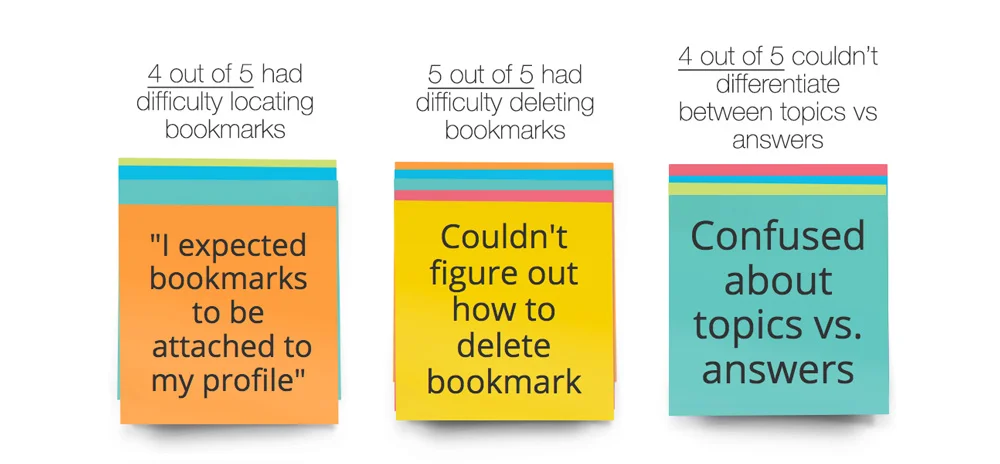
In order to understand the problem, it was necessary to define the user pain points through the eyes of the user. I conducted 5 usability interviews and discovered several re-occurring themes.
The biggest issues centered around the bookmarks. All of the users I interviewed could not figure out how to delete bookmarked topics and every user went to the profile section to search for their bookmark. Some were so confident it would be in the user profile, they would return again and again only to feel frustrated at being unsuccessful in finding the location of the bookmarks.
"That's a lot of clicks to remove the bookmark"
2. DEFINE
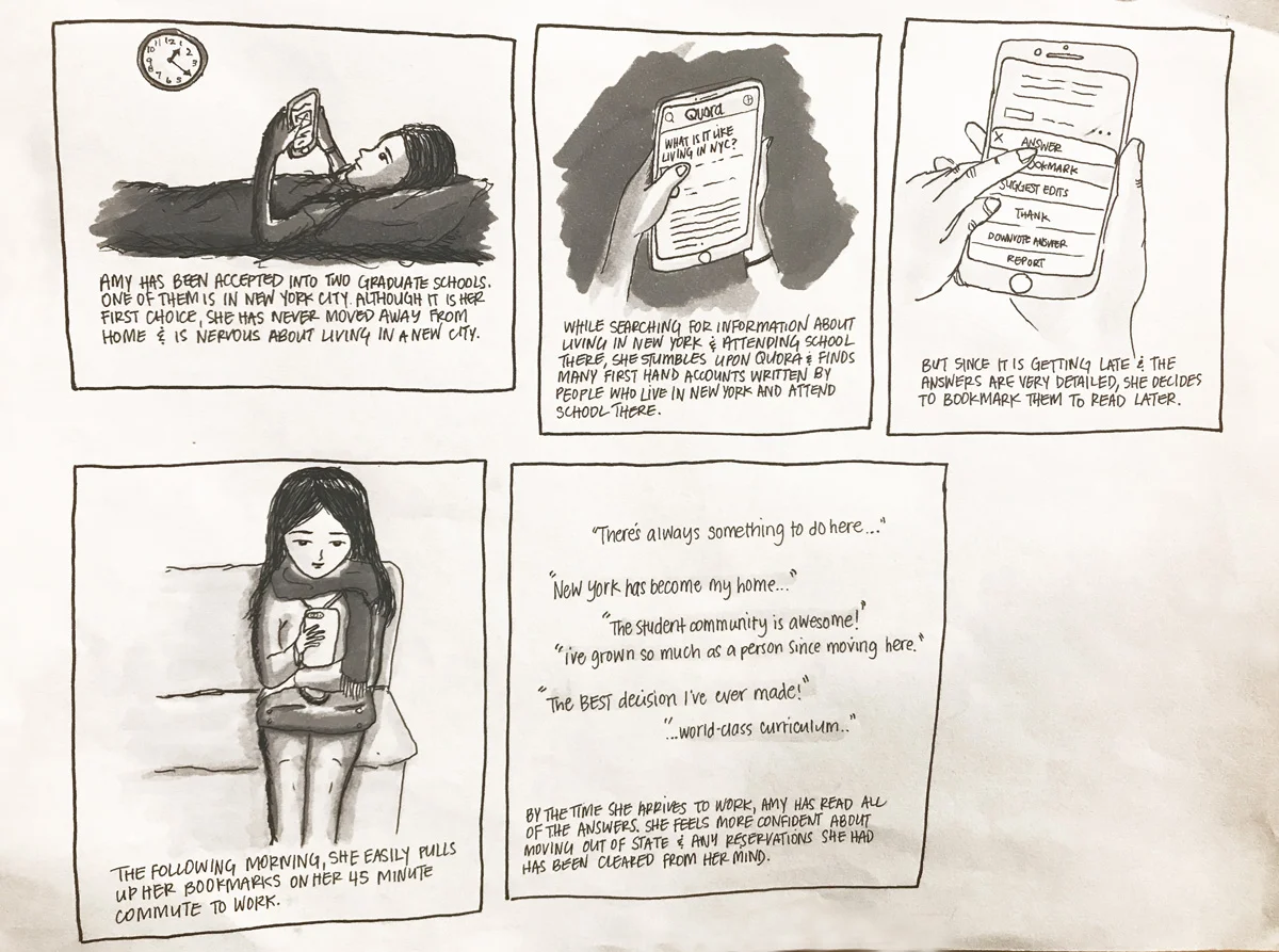
Scenario demonstrating how being able to access bookmarks easily can be beneficial to a user.

I decided to focus on two main problems: locating and deleting bookmarks. Using the information from the research, I created two personas that were typical of the users that I interviewed whom were mostly students or young professionals. Creating a persona allowed me to think in their shoes and implement changes in ways they see fit. I also created a scenario as that allowed me to fully immerse myself in a situation and think visually.
3. IDEATE
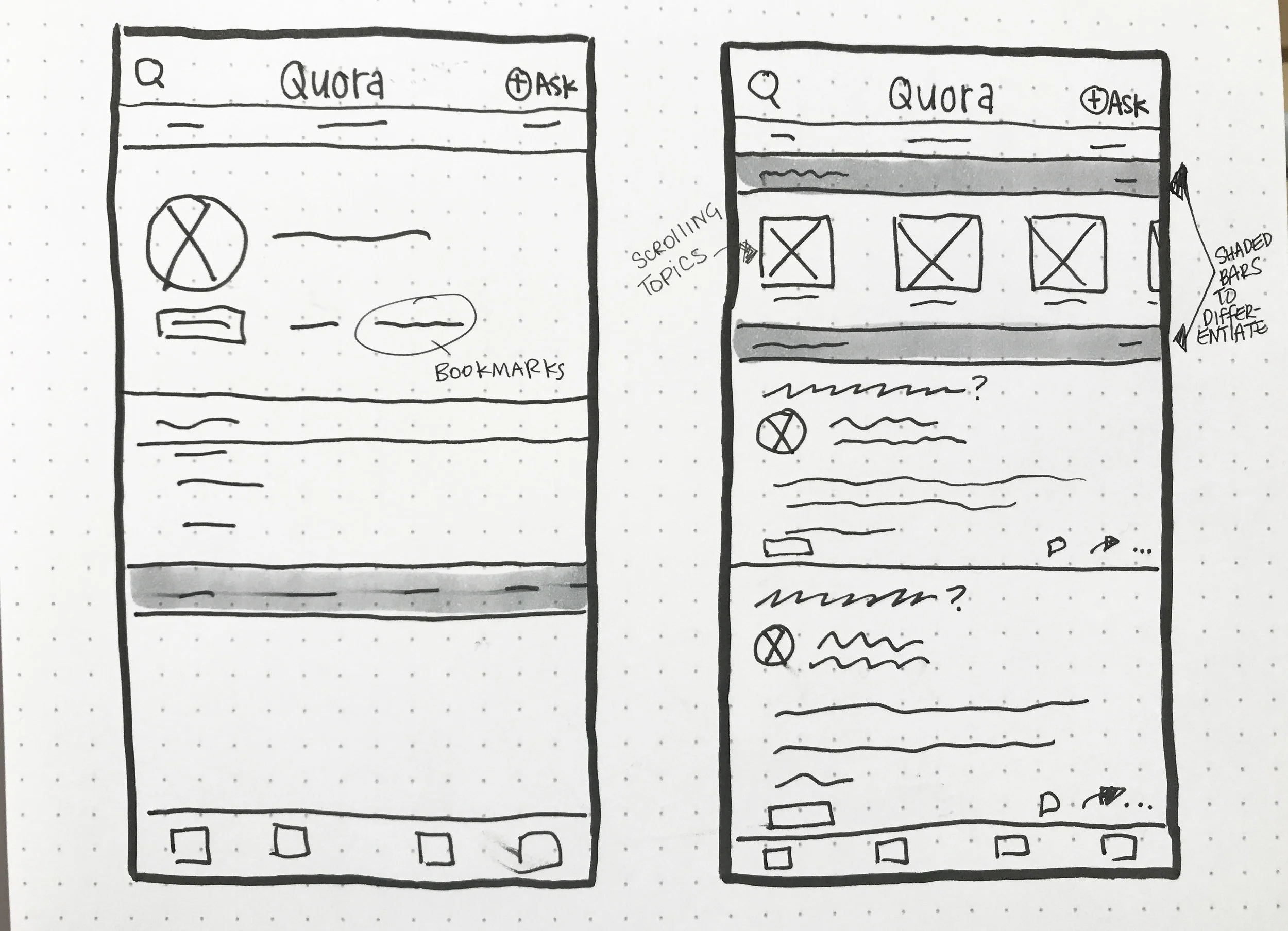
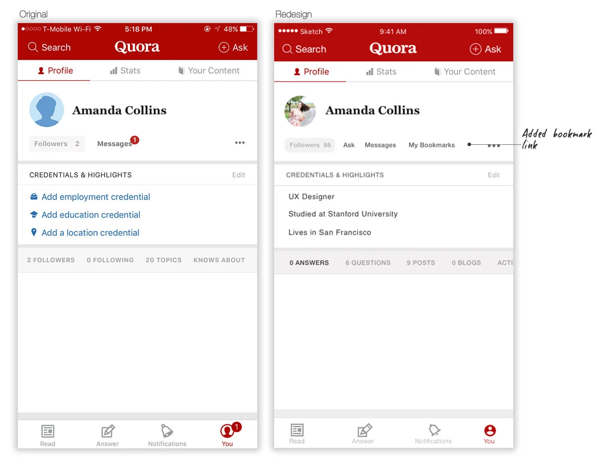
When I felt confident in identifying the source of the problem, I began to think of ways to solve the user pain points. Since 100% of the users went directly to their user profile to search for bookmarks, the obvious place to put a bookmark link was in the profile section. I also considered the current placement of the bookmark page from the business perspective of Quora. Having the bookmark link on the main page makes it easy and convenient for people to access once they know where it is. For this reason, I decided to leave the original bookmark link in place. The second main problem revolved around the deletion of bookmarks. During the user testing phase, I noticed that people had trouble differentiating between bookmarked topics and bookmarked answers. This led to confusion on why some answers could be deleted easily while others could not. In addition, to delete a bookmarked topic, one had to exit their bookmarks, search for the topic again and delete it directly from the topic page.
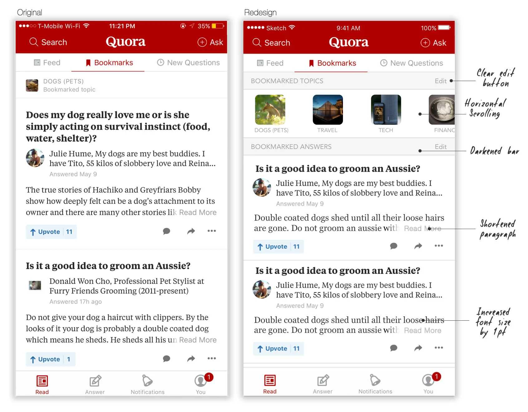
In the hi-fidelity mockups, the sections are clearly defined by shaded sections labeled "bookmarked topics" and "bookmarked answers". In the original screen, users would overlook the topic label and not differentiate between the sections. I also decided that a horizontal scrolling of the topic section would keep things more organized and further differentiate the two sections. The edit button would make it easy for users to organize and delete any bookmarks if needed. To keep things uncluttered, I shortened the preview answers to two sentences instead of the original three. Finally, since some users mentioned that it was hard to differentiate between the different answers because the font size was the same as the user description, I increased the font size of the answers by one point.
Hi-Fidelity Mockups
5. Testing
Using the clickable prototype, I tested the new redesign with 5 random users:
5/5 users went straight to their profile to look for bookmarks and was able to locate the bookmark section easily
5/5 users were able to delete bookmarked answers and topics with no trouble
5/5 users were able to differentiate between the bookmarked topics and bookmarked answers
Takeaways